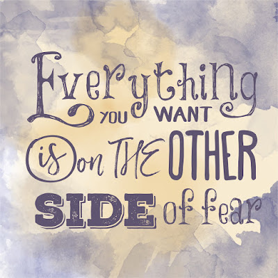
We’ve all received those beautiful handwritten invitations — the words flowing across them, the stylized letters full of artistic flair, adding just the right touch of formality to the occasion. Calligraphy has been described as “a type of visual art related to writing.” It underlines the reality that while images take a project from boring to engaging, one should never forget the importance of choosing the right font to accompany them.
It’s not all about style, after all. There are practical considerations as well. For instance the sans-serif fonts are considered more readable and are generally used for the body of an article.
Mull over, too, the fact that while the selection of typography is impressive, there’s no need to stick to your tried and true. In this veritable smorgasbord of style it’s always fun to sample the unfamiliar too. But don’t overdo. Too much is like a room full of different personalities — fun at first, but generally doesn’t really work. For more facts, and fun, on fonts try these informative sites:
Ben Hunt’s Web Design From Scratch
A Practical Guide to Topography on the Web


