In just two days Valentine’s Day will be here and you are working on a last-minute project. The design has been imagined, the illustrations found, the text decided.
However, while you might know what to say, you also know that ‘how’ you say it is equally important in graphic design. Whether you’re working on a promotion for Feb. 14 or a special card for your own Valentine, choosing the right font goes a long way to pulling mood and message together.
I have to be honest. When it comes to typography I really only know what I like; whether it’s the right font for the project I’m less certain about.
When I worked in print media, the discussion was always about serif verses sans serif. The popular notion at the time was that serif was preferred for print as it was more ‘readable’. Italic and bold were used to emphasize, but sparingly.
Mixing it up was also the suggestion, which the editorial department did incoprorating different fonts for cutlines, headlines and articles. It was a format to follow and, as such, while there was variety in it, it didn’t leave things open for us to experiment with typography the way the advertising people could.
So, when I sit down now to work on a project, I often find myself staring with vapid expression at the countless possibilities for text to highlight my illustration and define my copy. Rather than why I should pick one over the other, it’s more likely that I simply select one I like.
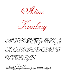
Taking what’s right and what’s wrong out of the design aspect of typography then, since I admit to really having absolutely no idea, I decided to go on a little search in the final days of this Valentine countdown for fonts that say romance to me. And these are what I like: